A detailed look at my process designing Places, a mobile app to improve the lifestyle of remote workers.
CHALLENGE
Design a mobile app in 1 week
ROLE
UX Designer
TEAM
Ben Dunkel
TIME
5 days
Overview
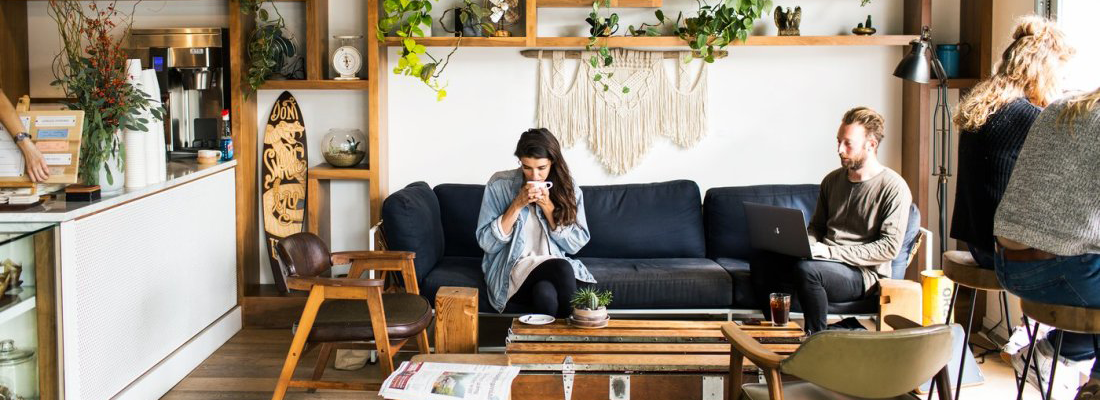
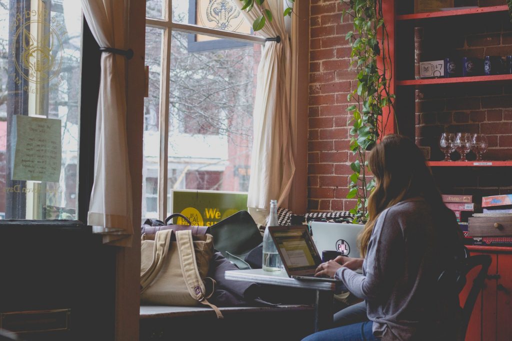
Places was designed as part of my first project with General Assembly. I was paired with a partner and tasked with designing an app based on their passions. Upon talking to my partner, I learned that they were extremely passionate about coffee, especially their local shops in L.A., and utilizing them as places to get work done in the afternoons. With remote work taking over the world since 2020, I thought that this could be a fertile area in which to explore new possibilities.
Over the course of this quick, one-week design sprint, I followed the double diamond design process. My final outcome was Places, an app designed to give users greater awareness of their local coffee shops and other places to work remotely. So let’s take a look at my process, starting with the problem.
Table of Contents
Problem
A global study by OWL Labs revealed that 62% of workers aged 22 to 65 claim to work remotely, at least occasionally. Since 2009 this number has risen 159% and is expected to continue to rise as more people adjust to this change. Working remotely and the flexibility it brings can benefit workers in a number of ways, but it is not without its downfalls. Despite this freedom to work from anywhere, not all places are created equally. And with the increase in numbers of remote workers, go-to places like coffee shops have become overcrowded. Remote workers can’t afford to waste time looking for a table, an outlet, or an open parking space during the day. As a result, many choose to stay and work at home.
User Research
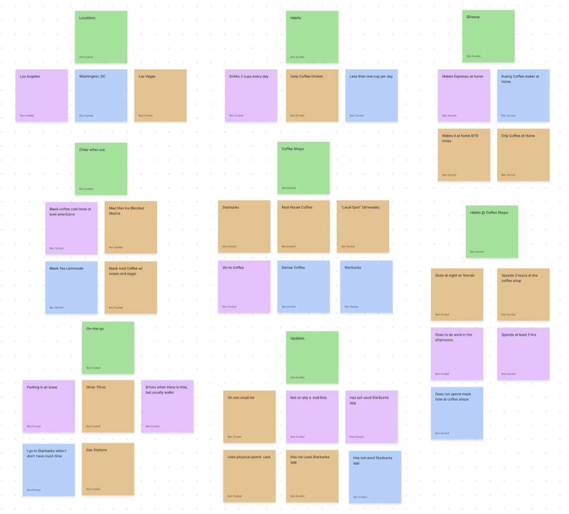
My next step was to reach out to potential users to conduct some 1-on-1 interviews. I spoke with three people across the country and found some interesting commonalities between them.
First, all three drink a lot of coffee. They were all daily coffee consumers in some form or fashion. Next, I saw that despite their habit, none were currently using an app for coffee rewards or loyalty points. This meant they weren’t taking full advantage of the technology currently available. And lastly, all three shared similar anxieties over the time spent searching for the best place to go, and defaulted to what they know. The time spent parking or looking for a table influences or even dictates their habits when it comes to coffeeshops.
Persona
To align my vision I created a target persona, Sara. She is a busy 30 year old who works as a loan officer for small businesses in Los Angeles. She’s passionate about coffee and is excited by the opportunity to work remotely, but time constraints restrict her from exploring more local coffee shops. While she knows L.A. has a rich coffee scene, she doesn’t have time to waste looking for parking, or finding an available outlet, or even seeing if there’s enough room for her to sit down with some friends. So Sara goes to the same place and orders the same thing every week.
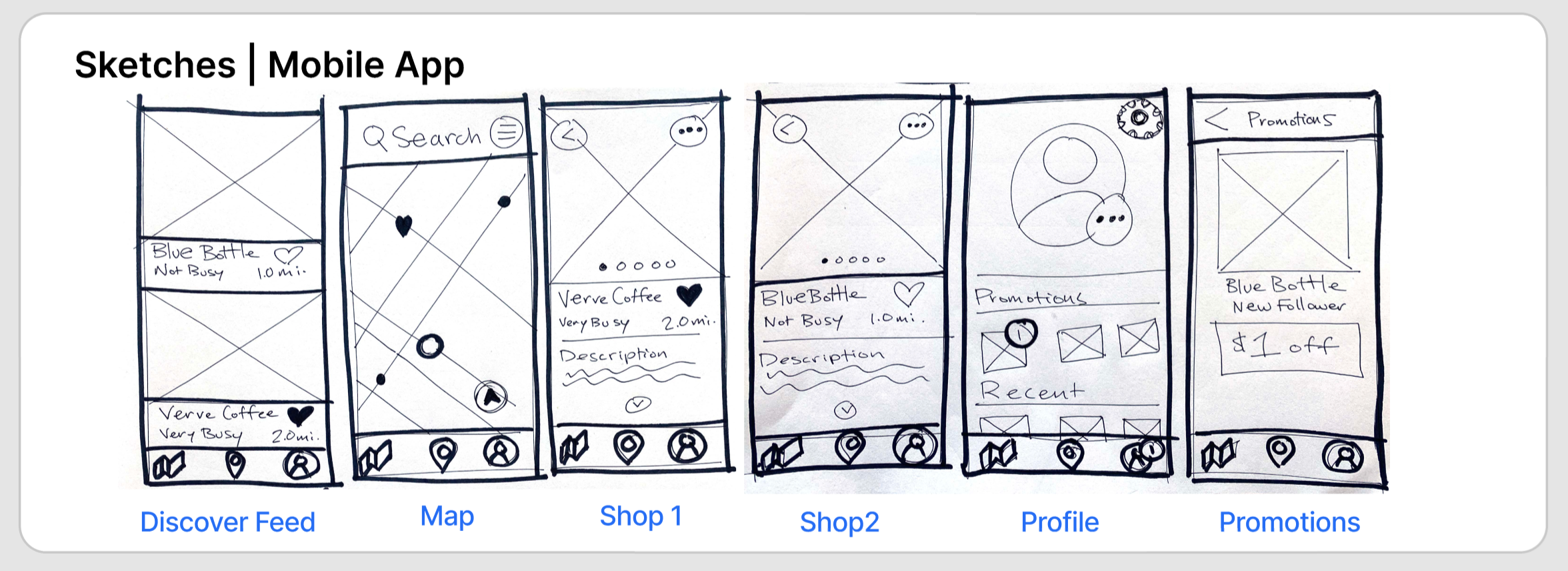
Sketches
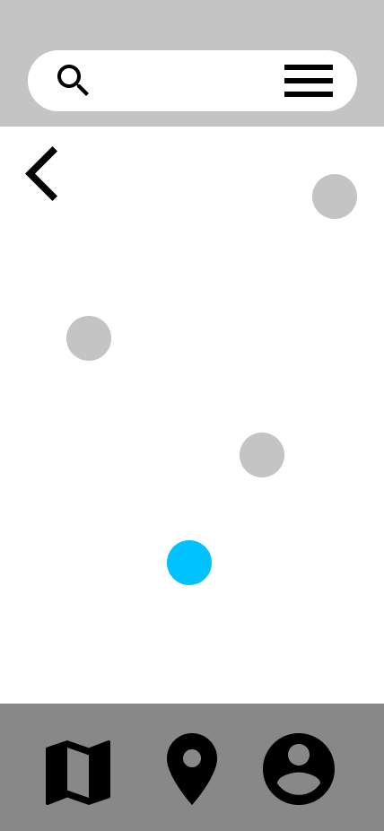
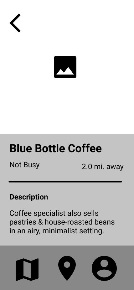
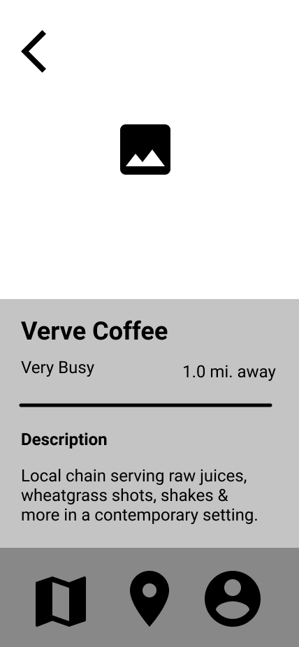
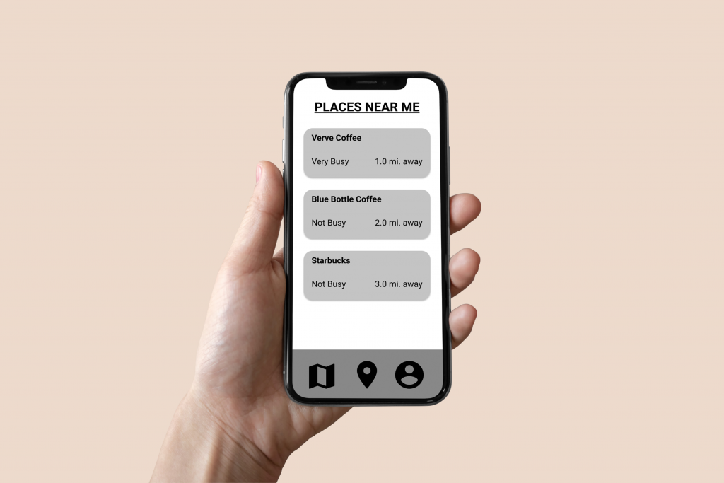
To flesh out my ideas I did several rounds of sketching. For me this was the fastest and most logical way for me to explore different ideas and work out some of the issues I foresaw. I focused my attention on the key screens that I would need to create. This started with a home page that quickly shows users what’s near them. The next screen would be a map page which would let users view and search in different areas. Users would be able to zoom in and out to set the size of the area they’d like to search in. Each location would need a page with a description, photos, and necessary information such as distance and potential wait times. Users would also need a profile page for them to update their information and settings as well as access potential customer loyalty rewards.
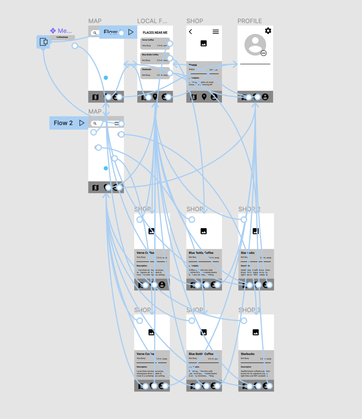
Wireframes
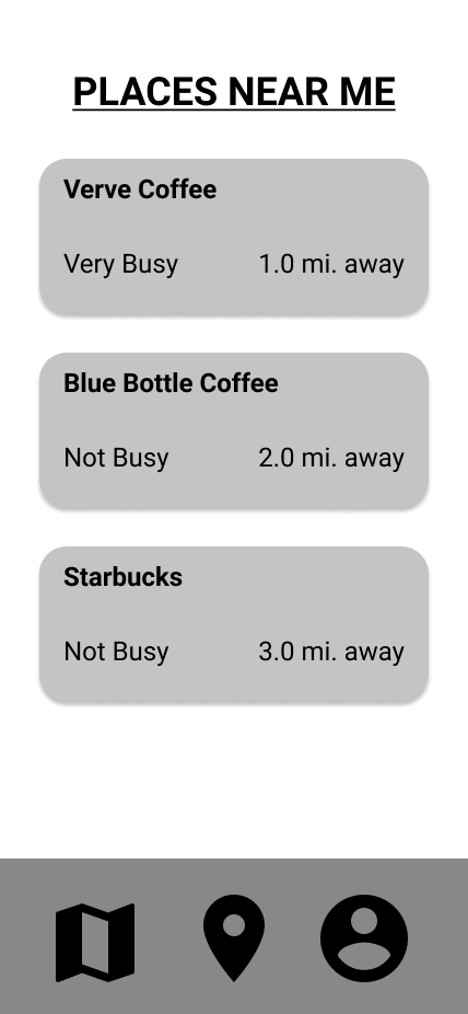
I used Figma to design the main screen, to show users just what’s near them, a map page with a search function that I animated using Figma’s component overlay, individual business pages for each of the example workspaces, and finally, a bare bones user profile page.
Interactive Prototype
Therefore, it was time to begin prototyping the app. But, all the “extra features” that I had imagined fell away one by one as I prioritized more core functionalities. I would need to create only so many pages in order for this app to actually work. So I focused my efforts on the main goal, which was helping users find potential work spaces and identify how busy they are ahead of time.
Usability Testing
Usability Testing was extremely fun and surprising. I created a short 10 question survey that I would ask users. I tested out the app’s basic features with 3 participants and quickly learned things I hadn’t considered. Like how the “home” button and the map imply confusingly similar functions to users. But overall they understood the minimal aesthetic, accomplished the task and scored the app favorably in learnability, efficiency, memorability, error management, and satisfaction.
My takeaways from this were that the app’s familiar design allowed users to intuitively navigate, and that the functionality was sound enough to be used for its intended purpose. Although I would like to take this project further, this will be the final step of this design process.
Summary
The goal of this short project was all about solving user’s problems and I feel like this app successfully does just that. Listening to coffee enthusiasts and remote workers allowed me to glean insights into their culture that were not immediately apparent. The disconnect between the freedom to work remotely and the time constraints of busy individuals made for a challenging yet fun problem to tackle.